


Telus Health · Digital health
Patients could reach the waiting room for an on-demand consultation with important tasks unfinished. Clinicians then had to collect missing information during the appointment, reducing the time available for care.
I redesigned preparation as a distinct stage of the journey. Patients could see what was required, complete one focused task at a time and understand whether they were ready to join. The work contributed to a 68% reduction in consultations requiring administrative intervention, a 40% increase in required patient information and an increase in preparation completion from roughly 20% to 70%.
Role
Product designer
Scope
Product discovery, journey design, interaction design, prototyping, usability testing, delivery support and design QA
Team
1 x product manager, 1 x copywriter, 4 x clinicians, 15 x engineers
Timeline
3 months
Platform
iOS, Android and Responsive web
Better preparation upstream meant clinicians could spend more of the consultation providing care instead of chasing information.
68%
Consultations requiring administrative intervention
Fewer appointments began with clinicians needing to resolve missing patient information.
+40%
Completion of required patient information
More patients supplied the documents and details needed before the consultation.
~20% to ~70%
Preparation completion
Far more patients completed preparation before joining the waiting room.
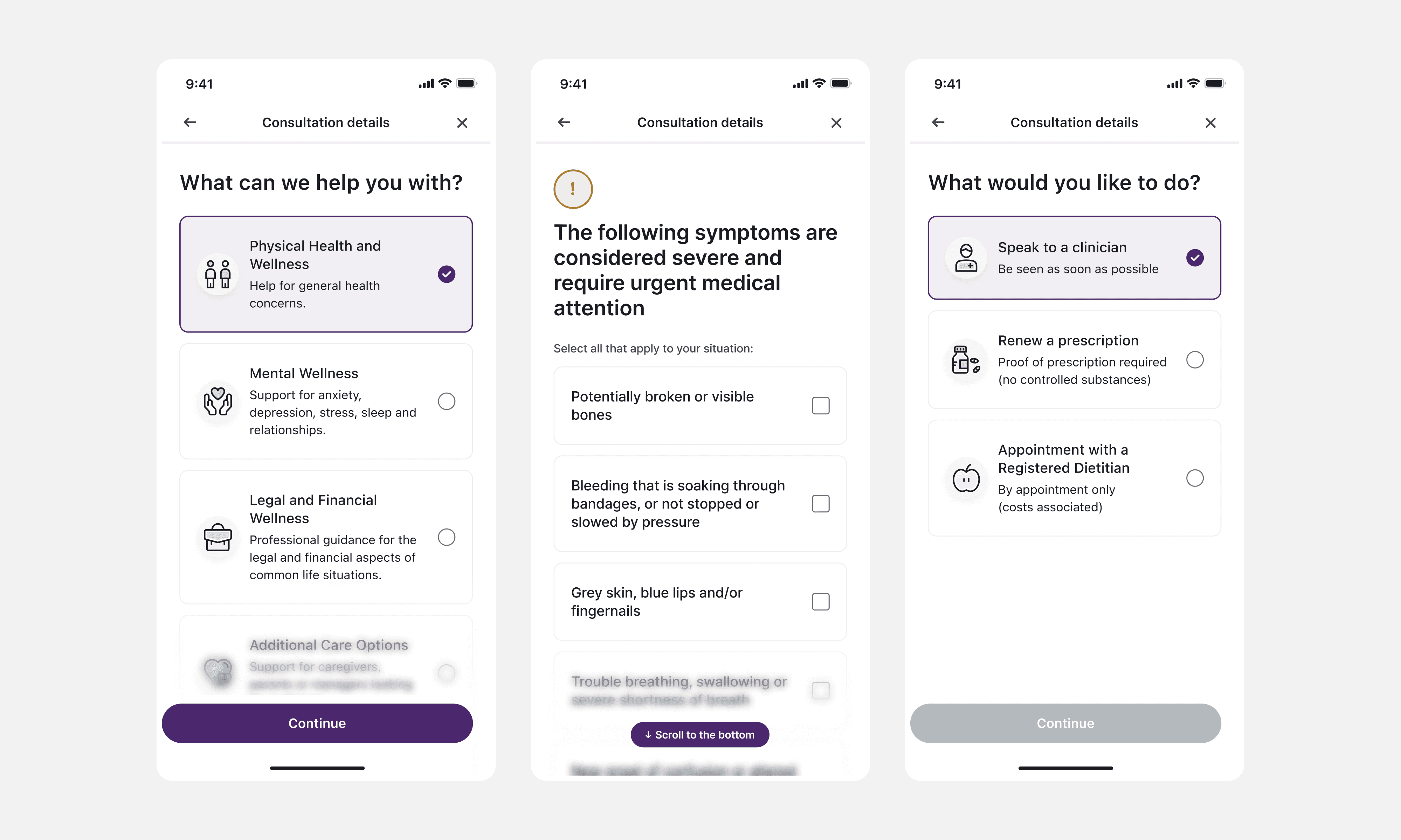
An on-demand consultation could require medical questions, photographs, identification and pharmacy details. The existing journey presented these as steps towards the waiting room, but patients could continue without knowing what they had completed, what remained or why each task mattered.
Reaching the waiting room created a misleading sense of progress. The interface suggested that the patient was ready, while operationally the clinician was still waiting for essential information.
The consequences affected both sides of the consultation. Patients faced unexpected delays at the point they expected to receive care. Clinicians inherited unfinished work and spent time requesting photographs, confirming details or explaining requirements that should have been addressed beforehand.
For patients
The journey did not make expectations or progress clear. Missing information could create delays at the point when they expected to receive care.
For clinicians
Consultations began with avoidable administration, reducing the time available to understand and treat the patient’s concern.
For the service
Incomplete preparation introduced friction into a time-sensitive clinical workflow and made consultation quality less predictable.

I looked across the whole journey rather than treating identification, pharmacy details, questionnaires and uploads as unrelated forms. Patient behaviour showed where people stopped progressing, while clinician feedback revealed the downstream cost of missing information.
The central question became: where should preparation end and waiting begin?
The existing experience had blurred those stages together. The most important decision was therefore structural: preparation needed its own place in the consultation journey.
Before: Assessment → Waiting room with unfinished tasks.
After: Assessment → Preparation → Review → Enter consultation
This reframed the work. The goal was no longer to improve a collection of forms. It was to help patients understand when they were ready for care and help clinicians begin with the information they needed.
In an ideal journey, every patient would provide every relevant item before joining. In healthcare, however, making everything mandatory can create unnecessary barriers. Some information was essential, while other information could be collected another way or intentionally declined.
1
Focus
Help patients complete one clear task at a time without losing sight of the overall journey.
2
Visibility
Make completed, outstanding and incomplete requirements easy to understand before the patient enters the waiting room.
3
Flexibility
Allow clinically valid alternatives where a hard stop would create an unnecessary barrier to care.
The solution had to work within constraints that shaped both the interaction model and the level of flexibility we could offer.
All patient data and flows needed to meet regulatory and clinical requirements. The experience also depended on legacy backend systems that limited how information could be stored and passed between stages.
The entire preparation flow had to operate inside a modal interface. There could be no page refreshes or redirects, and the ability to save progress was limited. That made status, orientation and recovery especially important. If a patient became confused, the surrounding interface could not simply rely on a new page or a conventional navigation structure to reset their understanding.
I worked closely with clinicians and engineers to understand which rules were clinically necessary, which reflected technical limitations and where the experience could offer a safer alternative. This prevented us from presenting every requirement as equally strict.

I introduced a dedicated preparation stage between the assessment and the waiting room. Instead of encountering loose requirements around the consultation, patients were clearly told that they were getting ready for care.
The journey explained what needed to happen and ended with a review. Patients could confirm what they had supplied, see anything outstanding and understand whether an incomplete item affected their ability to continue.
This gave progress a clearer meaning. Completing a question was no longer confused with completing preparation, and entering the waiting room became an informed step rather than an accidental handover of unfinished work.

2. Making complex preparation easier to complete
Preparation could involve sensitive or unfamiliar requests. Showing identification, pharmacy details, photographs and medical questions together risked making the journey feel heavier than it was.
I separated complex requirements into focused tasks, usually one per screen. Each screen explained what was needed, why it mattered and what the patient should do next. This reduced cognitive load on mobile and gave important guidance room to breathe.
Progress cues connected each task to the wider goal of becoming ready for the consultation. Patients could focus on the immediate action without losing their sense of place.
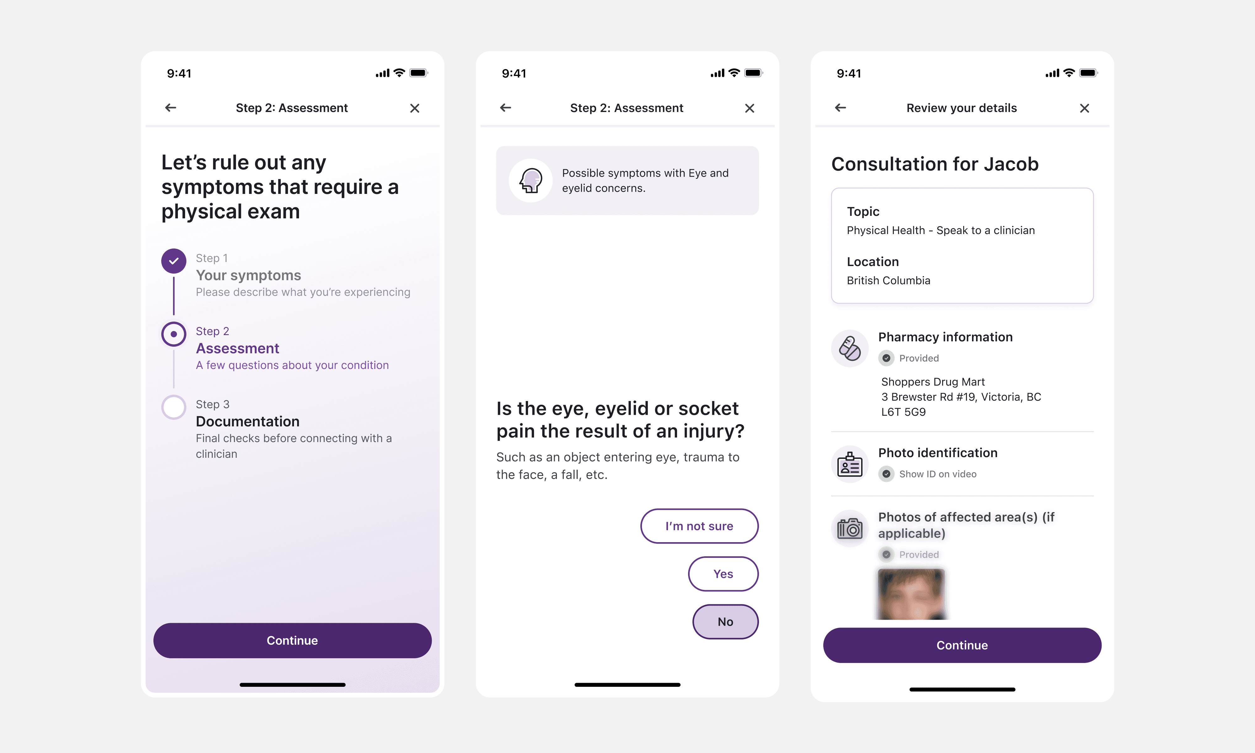
Making status visible
In the original journey, continuing could be mistaken for completing. The redesign made status explicit at both the task and journey level.
The preparation summary showed what was complete, what remained and whether an alternative had been accepted. Status language stayed calm and precise. An incomplete item was important, but it did not always mean that the patient had failed or that care was unavailable.
This also gave clinicians better context. Missing information was less likely to arrive unexpectedly at the start of the consultation.

A healthcare journey has to work for people who cannot follow the ideal path. Making every requirement a hard stop might improve completion figures, but it could also prevent someone from accessing care unnecessarily.
I designed explicit alternatives for situations where a patient could still progress safely. Identification could be verified during the video consultation where appropriate. A patient could choose not to provide pharmacy information instead of abandoning the journey or appearing to have skipped it by mistake.
These decisions were recorded and surfaced in the review. Patients understood the consequence of their choice, and clinicians could see what remained unresolved.
The principle was simple: allow progress when it was clinically safe, but never create the impression that missing information did not matter.
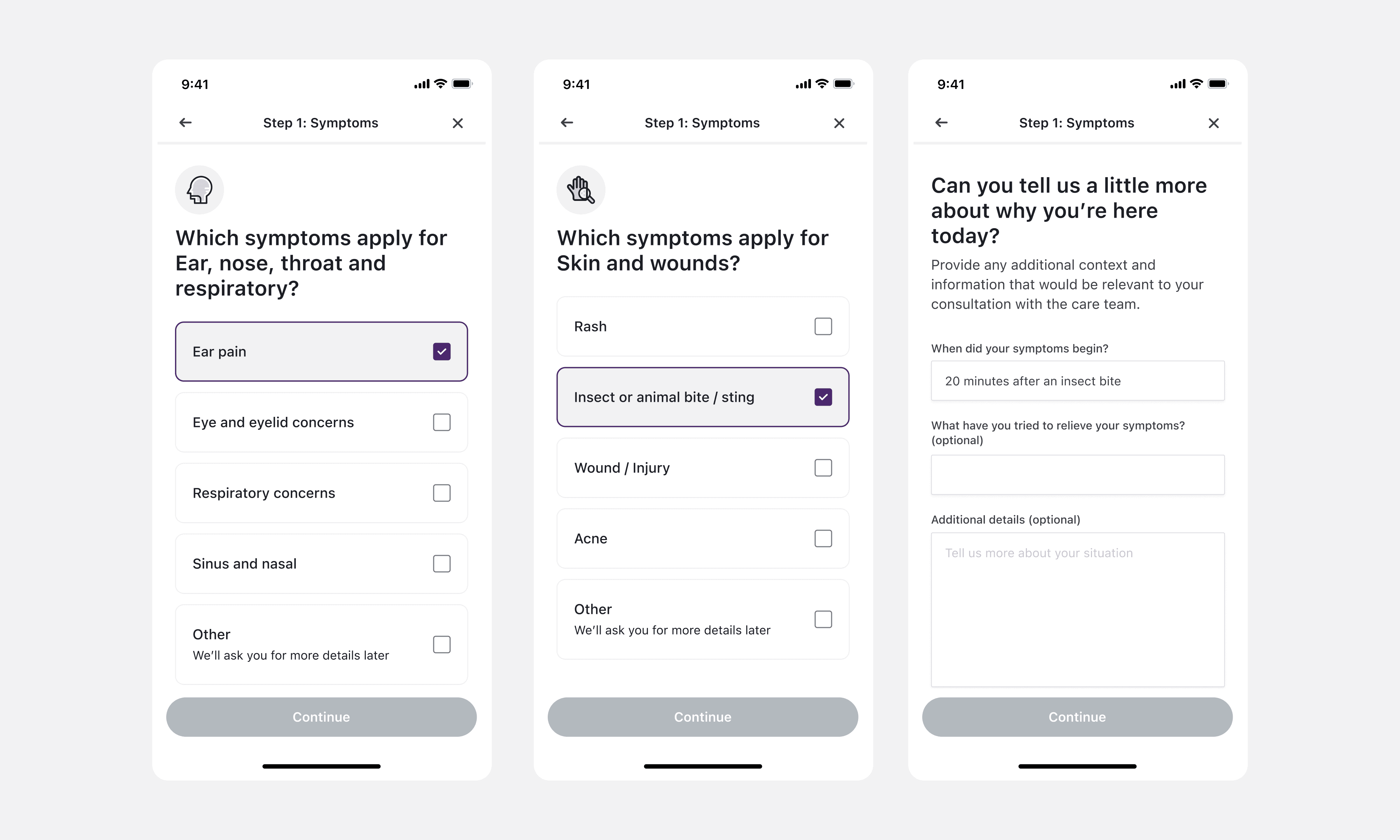
Testing the journey, not just the screens
I tested the redesigned journey with six external participants. I wanted to know whether people understood preparation as a distinct stage, could recognise what they had completed and knew what remained before entering the consultation.
Testing individual screens was not enough. Someone could complete each task successfully and still misunderstand the overall state of the journey. I therefore focused on transitions, the review step and what happened when a patient continued with an accepted alternative.
The findings helped refine the hierarchy, status language and distinction between required, optional and unresolved tasks.
Delivery involved a product manager, copywriter, four clinicians and fifteen engineers. Clinicians helped define safe alternatives, engineers exposed the consequences of legacy systems, and the copywriter translated clinical requirements into language patients could understand. I used flows, prototypes, documented edge cases and design QA to keep the experience coherent through implementation.
Working across a large delivery team
The project involved four clinicians, fifteen engineers, a product manager, a copywriter and me as the product designer. Coordinating across that group required more than handing over finished screens.
Clinicians helped define which information was essential and where an alternative remained safe. Engineers made the consequences of legacy systems and modal behaviour visible early. The copywriter helped turn clinical requirements into language patients could understand. Product connected the experience to operational outcomes and delivery priorities.
My role was to keep the journey coherent across those perspectives. I used flows and prototypes to make behaviour visible, documented edge cases and worked through the details with Engineering during implementation.
This helped the team make decisions at the level of the whole consultation rather than optimising whichever form happened to be in front of us.
The value went beyond improving a set of forms. Patients gained a clearer route into care, while clinicians began more consultations with the information they needed. The work moved administrative effort out of the appointment, where time was most valuable.
68% reduction in consultations requiring administrative intervention
Clinicians began fewer appointments by chasing missing documents or resolving preparation tasks.
40% increase in required patient information completed
More patients supplied the information needed before their consultation.
Preparation completion increased from approximately 20% to around 70%
The new stage, clearer status and more focused tasks helped substantially more patients complete the preparation journey.
The project showed me that a journey can appear complete in the interface while remaining incomplete operationally. Patients were reaching the waiting room, but clinicians were still doing part of the preparation work.
Separating preparation from waiting created a clearer mental model for patients and a cleaner handover to clinicians. It also reinforced the importance of designing for exceptions. In healthcare, the quality of an experience is often revealed by what happens when someone cannot follow the expected path.
If I continued the work, I would measure abandonment at task level, identify which missing requirements created the greatest clinician burden and explore whether better preparation improved consultation quality and patient outcomes.
Next case study
Let’s work together.
I’m open to Senior Product Designer roles where complex problems, strong craft and measurable outcomes matter.
hey@razrashid.com
" height="32px" id="hrO0YMoaZ" width="32px"/><path d="M 3.6 16 L 0.2 16 L 0.2 5.3 L 3.6 5.3 Z M 1.9 3.8 C 0.8 3.8 0 3 0 1.9 C 0 0.8 0.9 0 1.9 0 C 3 0 3.8 0.8 3.8 1.9 C 3.8 3 3 3.8 1.9 3.8 Z M 16 16 L 12.6 16 L 12.6 10.2 C 12.6 8.5 11.9 8 10.9 8 C 9.9 8 8.9 8.8 8.9 10.3 L 8.9 16 L 5.5 16 L 5.5 5.3 L 8.7 5.3 L 8.7 6.8 C 9 6.1 10.2 5 11.9 5 C 13.8 5 15.8 6.1 15.8 9.4 L 15.8 16 Z" fill="rgb(255, 255, 255)" height="16.000000190734863px" id="Ocq6OAmI9" transform="translate(8 8)" width="16px"/></svg>)
" height="32px" id="JVzKgZkM5" width="32px"/><path d="M 0 2.667 C 0 1.194 1.194 0 2.667 0 C 4.139 0 5.333 1.194 5.333 2.667 C 5.333 4.139 4.139 5.333 2.667 5.333 C 1.194 5.333 0 4.139 0 2.667 Z" fill="rgb(26, 188, 254)" height="5.333399999999999px" id="ydcjNquk_" transform="translate(15.983 13.333)" width="5.333300000000001px"/><path d="M 0 2.667 C 0 1.194 1.194 0 2.667 0 L 5.333 0 L 5.333 2.667 C 5.333 4.139 4.139 5.333 2.667 5.333 C 1.194 5.333 0 4.139 0 2.667 Z" fill="rgb(10, 207, 131)" height="5.333300000000001px" id="NPUpvGMxn" transform="translate(10.65 18.667)" width="5.333399999999999px"/><path d="M 0 0 L 0 5.333 L 2.667 5.333 C 4.139 5.333 5.333 4.139 5.333 2.667 C 5.333 1.194 4.139 0 2.667 0 Z" fill="rgb(255, 114, 98)" height="5.3332999999999995px" id="jGljsiE4Z" transform="translate(15.983 8)" width="5.333300000000001px"/><path d="M 0 2.667 C 0 4.139 1.194 5.333 2.667 5.333 L 5.333 5.333 L 5.333 0 L 2.667 0 C 1.194 0 0 1.194 0 2.667 Z" fill="rgb(242, 78, 30)" height="5.3332999999999995px" id="JUFtWyYKp" transform="translate(10.65 8)" width="5.333399999999999px"/><path d="M 0 2.667 C 0 4.139 1.194 5.333 2.667 5.333 L 5.333 5.333 L 5.333 0 L 2.667 0 C 1.194 0 0 1.194 0 2.667 Z" fill="rgb(162, 89, 255)" height="5.333399999999999px" id="StHT4lRlg" transform="translate(10.65 13.333)" width="5.333399999999999px"/></svg>)
©
Selected works / Raz