#brightness");-webkit-filter:brightness(100%)}figcaption{text-align:center;color:#6e6e6e;font-size:.9rem}video{border:1px solid #ededed}.text-small{font-size:.85rem;letter-spacing:.4px}.text-display-m{font-size:1.25rem}.text-display-l{font-size:1.8rem;line-height:1.2}.text-display-xl{font-size:2.1rem}.text-dark{color:#222}.text-primary{color:#db0a5b}.coming_soon a h2:hover,.text-grey{color:#4b4b4b}.text-grey-two{color:#6e6e6e}.coming_soon a h2:after,.text-lightgrey{color:#d8d8d8}.text-orange{color:#ffbe52}.text-red{color:#db0a5b}.text-medium{font-weight:500}.text-serif{font-family:"PT Serif",serif}.text-sans-serif{font-family:GreycliffCF-Regular,Calibri,Trebuchet MS,sans-serif}.uppercase{text-transform:uppercase}.background-dark{color:#fff;background-color:#222}.background-light{color:#222;background-color:#fff}.push-right{margin-left:auto}.flex{display:flex}.row{width:100%}.col{flex:1 1}.col-padding-left{padding-left:1rem}.col-padding-left:only-child{padding-left:0}.col-padding-right{padding-right:1rem}.col-padding-right:only-child{padding-right:0}.article-listing article{width:50%}.article-link{display:block;font-family:GreycliffCF-Bold,Calibri,Trebuchet MS,sans-serif;color:#000;max-width:420px;width:100%}.paper{width:100%;max-width:1140px;margin:2em auto;padding:15px}.paper blockquote,.paper h1,.paper h2,.paper h3,.paper h4,.paper h5,.paper h6,.paper ol,.paper p,.paper ul{max-width:720px;margin-left:auto;margin-right:auto;width:100%}.paper ol,.paper ul{padding-left:2rem}.paper p{position:relative}.paper h1,.paper h2,.paper h3,.paper h4,.paper h5,.paper h6{font-family:GreycliffCF-Bold,Calibri,Trebuchet MS,sans-serif;font-weight:700;margin-top:4%}.paper h1:first-child,.paper h2:first-child,.paper h3:first-child,.paper h4:first-child,.paper h5:first-child,.paper h6:first-child{margin-top:0}.paper blockquote{font-size:1.35rem;padding:1rem 0 1rem 1rem;border-left:4px solid #db0a5b}.paper .paper_hook{font-size:1.15rem;color:#4b4b4b}.paper .marginless{margin-left:0;margin-right:0;width:100%;max-width:1140px;-webkit-transition:all .5s ease-in-out;transition:all .5s ease-in-out}.paper .marginless img{width:100%}.paper_featured{width:100%;padding:0}.paper_featured img{display:block;width:100%;max-width:1440px;margin:0 auto}a{color:#db0a5b;text-decoration:none;-webkit-transition:color .25s ease-in-out;transition:color .25s ease-in-out}a:hover{cursor:pointer;opacity:.75;text-decoration:underline}.content{padding:30px;max-width:1440px;margin:0 auto}.footer_end{width:100%;background:#ffe8b3}.footer_end .footer_content{display:flex;color:#000;max-width:940px;width:100%;padding:116px 0;margin:auto}.footer_end .footer_copyright p{margin-top:2rem;color:#996b00}.footer_end a{color:#cc8e00}.footer_end a:hover{text-decoration:none}.button{display:flex;align-items:center;border:2px solid #cc8e00;border-radius:4px;padding:.5rem 1rem;background:transparent;color:#cc8e00}.button:hover{cursor:pointer}.btn-arrow:after{content:"";display:inline-block;width:20px;height:20px;margin-left:8px;background-image:url(https://www.datocms-assets.com/22518/1582453057-arrow-r.svg);background-position:50%;background-repeat:no-repeat;background-size:contain}.text-section{display:inline-block;margin-bottom:2rem}.text-section:after{content:"";display:block;width:60%;height:3px;background:#db0a5b;position:relative;bottom:-8px}.hero{display:block;width:100%;padding-top:3rem;padding-bottom:4rem}.hero .hero_content{max-width:1440px;padding:0 30px;margin:0 auto}.hero .hero_text{max-width:460px}.hero .hero_content_spacing{margin-top:1rem}.overlap_margin{margin:0 30px}.overlap{position:relative;top:-100px;background:#fff;border-top-left-radius:.5rem;border-top-right-radius:.5rem}.case_study{display:block;font-size:1.25rem}.case_study a h1,.case_study a h2,.case_study a h3,.case_study a h4,.case_study a h5,.case_study a h6{color:#222}.case_study:after{content:"";display:block;border:1px solid #ededed;margin-top:2rem;margin-bottom:3rem}.case_study:last-child:after{content:"";border:0}.case_study.card{display:flex;align-items:center;background:#fff0f6;padding-bottom:0;padding-top:70px;overflow:hidden;border:1px solid #ffbdd7;border-radius:8px}.case_study.card h3{color:#330014}.case_study.card p{color:#99335c}.case_study.card img{width:100%;height:auto;margin:0;padding:0}.case_study.card:after{display:none}.card_content{width:40%;margin-right:5%;margin-left:15px;align-self:flex-end}.card_preview{display:flex;width:60%;align-self:flex-end;margin-right:15px}@media (max-width:1139px){.card h3{font-size:28px}.card p{font-size:18px}}.case_study_link{display:flex;align-items:center;-webkit-transform:translate(-40px);transform:translate(-40px);-webkit-transition:-webkit-transform .15s ease-in-out;transition:-webkit-transform .15s ease-in-out;transition:transform .15s ease-in-out;transition:transform .15s ease-in-out,-webkit-transform .15s ease-in-out}.case_study_link:before{content:"";position:relative;display:inline-block;width:32px;height:32px;margin-right:8px;background:url(https://www.datocms-assets.com/22518/1582453057-arrow-r.svg) 50% no-repeat;background-size:24px;opacity:0;-webkit-transition:all .25s ease-in-out;transition:all .25s ease-in-out}.case_study_link:hover:before{opacity:1}.case_study_link:hover{-webkit-transform:translate(0);transform:translate(0);text-decoration:none}.paper_footer{max-width:720px;margin:1rem auto;padding:0}.paper_footer a h4{color:#222;margin-bottom:.65rem}.paper_footer a p{font-size:18px}.paper_footer a:hover{text-decoration:none}.writing{width:100%;color:#d61f99;font-size:18px;font-weight:700;padding-right:15px;margin-right:15px;margin-top:12px}.writing:before{content:"";display:block;border-top:4px solid #d61f99;margin-bottom:16px;border-radius:4px}.writing-right article a{color:#222}.writing-container{padding-bottom:40px;border-bottom:1px solid #f2f2f2}.writing-container:last-child{border-bottom:0;margin-bottom:70px}.coming_soon:hover,.coming_soon a{cursor:not-allowed}.coming_soon a{text-decoration:none}.coming_soon a h2:hover{cursor:not-allowed}.coming_soon a h2:after{content:"(Coming soon)";display:inline;font-size:18px;font-style:italic;padding-left:16px;padding-right:16px;opacity:0;-webkit-transition:opacity .25s ease-in-out;transition:opacity .25s ease-in-out}.coming_soon a h2:hover:after{opacity:1}@media (max-width:1439px){.paper_featured{padding-left:30px;padding-right:30px}}@media (max-width:992px){.case_study.card{padding-top:45px}.case_study.card h3{font-size:26px}.case_study.card .card_content{width:50%;margin-left:8px}.case_study.card .card_preview{width:60%}}@media (max-width:767px){.paper_featured{padding-left:15px;padding-right:15px}.paper_footer{padding:15px}}@media (max-width:768px){.case_study.card{padding-top:40px;flex-wrap:wrap;flex-direction:column-reverse;overflow:hidden}.case_study.card h3{font-size:24px}.case_study.card .card_content{flex-basis:100%;width:100%;max-width:400px;margin-right:auto;margin-left:30px}.case_study.card .card_preview{width:100%;margin-right:auto}.case_study.card .card_preview img{align-self:center}}@media (max-width:568px){body,html{font-size:18px}.paper{margin:1em auto}.flex{flex-wrap:wrap}.text-small{font-size:.85rem;letter-spacing:.4px}.text-display-m{font-size:1rem}.text-display-l{font-size:1.3rem;line-height:1.2}.text-display-xl{font-size:1.6rem}.content{padding:15px}.col{flex-basis:100%;width:100%;padding:0!important}.footer_end{padding:15px}.hero{padding-top:2rem;padding-bottom:1rem}.hero .hero_content{padding:0 15px}.case_study{font-size:1rem}.case_study.card .card_content{width:auto}.case_study_link:before{background-size:18px}}@media (max-width:414px){.case_study.card .card_content{flex-basis:100%;width:auto;max-width:400px;margin-right:15px;margin-left:15px}.case_study.card .card_preview{width:100%;margin-right:auto}}
Immersing myself into businesses to solve problems through insight, strategy and design.
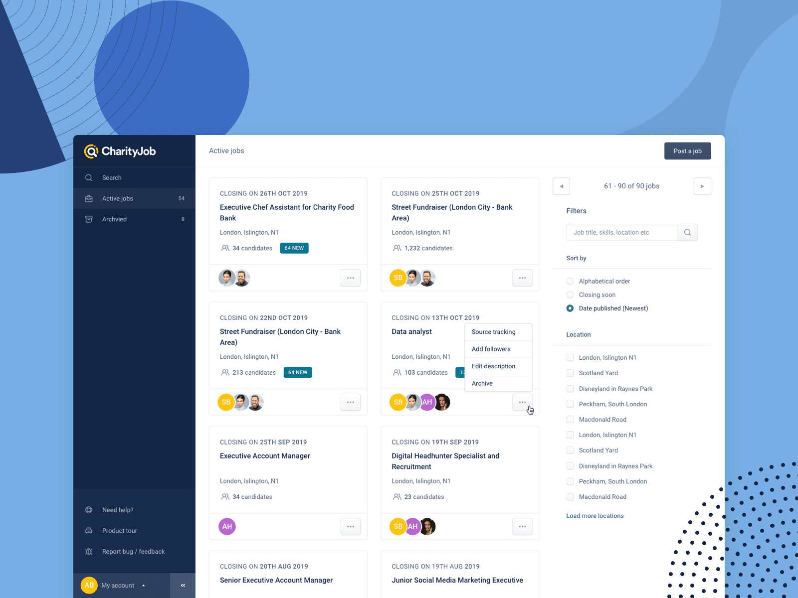
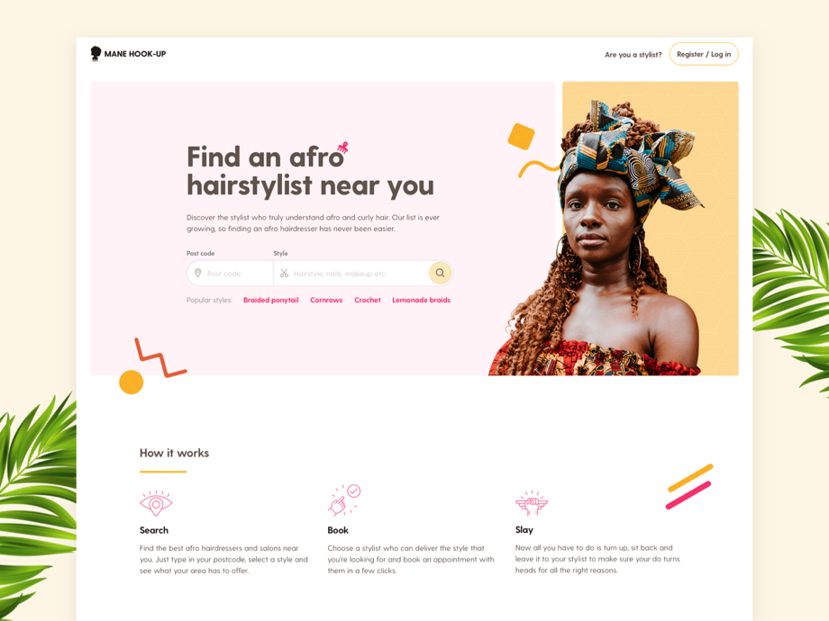